Avoiding Color Regret When Painting in January
Avoiding Color Regret When Painting in January
Avoiding Color Regret When Painting in January
It starts with a feeling of hopeful excitement. You've decided to take advantage of the slow winter months to finally repaint your living room. You spend a weekend surrounded by paint chips, dreaming of a fresh, new look. You settle on the perfect shade—a sophisticated greige you saw in a magazine or a warm white that promises to brighten the space. The painters come, the work is done beautifully, and for a few days, you're thrilled.
Then, a week later, the feeling starts to creep in. A little twinge of disappointment. The greige that looked so chic on the swatch now looks muddy and purple in the evenings. The warm white you thought would be sunny and bright just looks… beige. This nagging feeling is "color regret," and it is an especially common ailment for homeowners who paint during a Pittsburgh winter.
The unique lighting conditions of a gray January—low natural light, cool color temperatures, and heavy reliance on artificial bulbs—can drastically alter how a paint color appears on your walls. The color you loved in the store is not the color you get in your home.
But color regret is not inevitable. With a strategic approach to selecting and testing colors, you can make a choice you'll love all year round. For professional interior painting services that understand Pittsburgh's unique lighting challenges,. This guide will walk you through the common pitfalls of winter color selection and provide a clear roadmap to help you choose with confidence and avoid that sinking feeling of a costly mistake.
Why January is a Minefield for Color Selection
Choosing paint colors is always tricky, but doing it in January in Western Pennsylvania adds several layers of complexity. Your decision is being influenced by an environment that is temporary and extreme.
The "Gray Filter" Phenomenon
As we've discussed in other posts, the persistent cloud cover in Pittsburgh acts as a giant filter. Our guide on how Pittsburgh's gray skies change paint color perception explains this in detail., stripping warm wavelengths from the natural light. This cool, blue-heavy light fundamentally changes how pigments reflect color.
The Risk: You pick a color that looks great in the cool light of a January afternoon, but when the warm, direct sun of July hits it, the color transforms into something you didn't expect. A subtle greige might suddenly look aggressively tan. A soft blush might turn into bubblegum pink.
The Artificial Light Deception
With sunsets happening before 5:00 PM, you will spend most of your time viewing your new paint color under artificial light. The type of light bulbs you have—whether warm and yellow or cool and blue—will become the dominant factor. Learn more about how artificial lighting alters paint colors in Pittsburgh winters. in your color perception.
The Risk: You paint a sample on the wall and love how it looks under your cozy 2700K lamp. What you don't realize is that during the day, that same color looks flat and dull without the warm bulb to activate it. You've chosen a color for nighttime, not for the whole day.
The Indoor Hibernation Mindset
In winter, we crave warmth and coziness. This psychological pull can lead us to make impulsive choices. We might be drawn to a deep, moody color to create a "cocoon" effect, only to find that in the high-energy months of summer, the same color feels heavy and claustrophobic.
Common Mistakes That Lead to Color Regret
Avoiding regret starts with recognizing the most common traps homeowners fall into.
1. Trusting the Paint Chip: This is the cardinal sin of painting. A 2x2 inch square of printed paper cannot tell you how a color will look on 400 square feet of wall. The texture of the chip, the industrial lighting of the store, and the lack of surrounding context make it a completely unreliable guide.
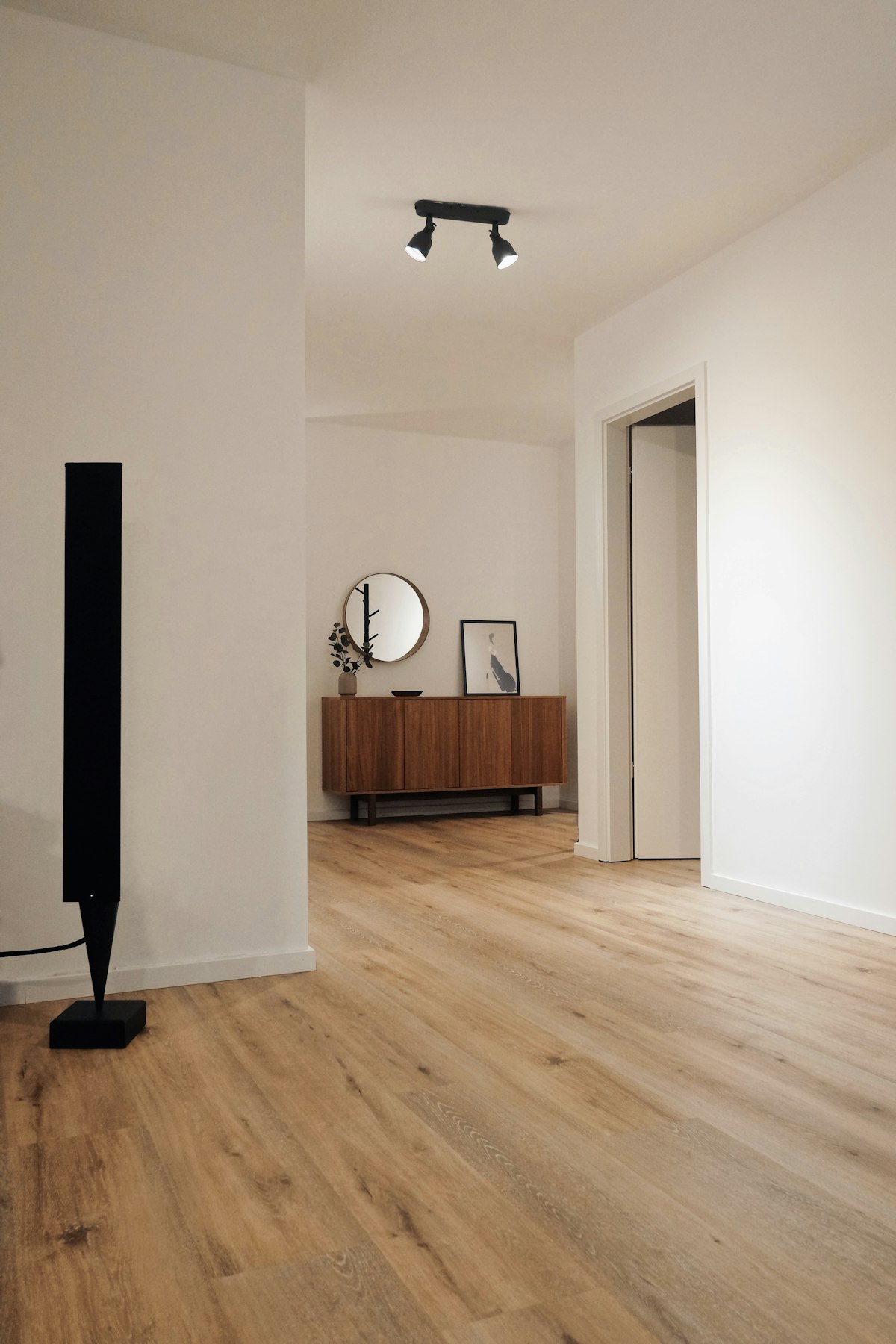
2. Testing in Only One Spot: You paint a small swatch in the brightest part of the room. It looks great. But you forget that the corners of the room, the wall behind the sofa, and the space above the window receive totally different light and will render the color differently.
3. The "Daytime Only" Test: You test colors on a Saturday afternoon and make your decision. You don't check how the color looks at 8:00 AM on a dark Tuesday or at 9:00 PM under your reading lamp. You are only seeing a third of the story.
4. Forgetting the Undertones: You choose a gray, but you don't realize it has a strong purple undertone until your warm beige carpet brings it out, making the whole room feel off-balance.
A Step-by-Step Guide to Confident Color Selection
A Step-by-Step Guide to Confident Color Selection
To avoid regret, you need a disciplined testing process. This isn't about guesswork; it's about gathering data on how a color performs in your unique space.
Step 1: Gather Your Contenders (But Not Too Many)
Start by browsing online and in magazines to find a general color family you like. Then, go to the store and pick up 3 to 5 contenders. Limiting your options prevents "analysis paralysis." If you bring home 15 shades of gray, they will all start to look the same.
Focus on the "why." Are you trying to make the room feel brighter? Cozier? More modern? Your goal should guide your color family choice.
Step 2: The Poster Board Method (The Only Test That Matters)
Do not paint samples directly on your wall. The existing wall color will alter your perception of the new color.
The Method: Get a few pieces of white poster board or large foam core. Paint a large sample (at least 2x2 feet) of each color onto a separate board. Leave a one-inch white border around the edge of your sample.
Why This Works: The white border isolates the color, acting as a "palate cleanser" for your eye. It allows you to see the true hue of the paint without the influence of the old color next to it. It is also portable, which is critical for the next steps.
Step 3: The 24-Hour, Multi-Location Tour
Your painted poster boards are now your test subjects. For the next 24-48 hours, you will move them around the room to see how they perform in different conditions.
The Brightest Wall: Tape the board to the wall that gets the most light. This shows you the color at its most vibrant.
The Darkest Corner: Move the board to a corner, behind a door, or behind a piece of furniture. This is the shadow test. Does the color turn muddy and die? Or does it retain its character?
Against the Trim: Place the board directly against your window casings and baseboards. Does the color complement the white or wood tone of your trim?
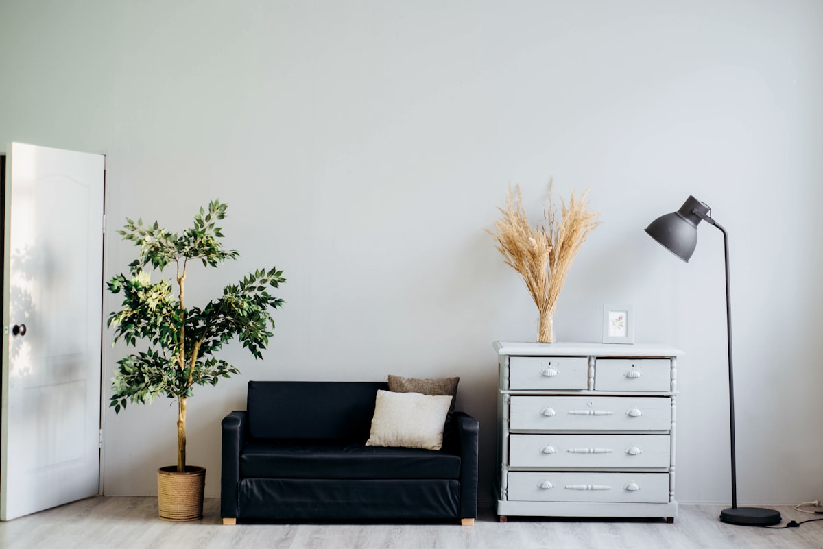
Next to Your Furniture: Put the board behind your sofa or next to your area rug. Does it clash with the undertones in your existing upholstery and textiles? A beautiful greige can look terrible next to a yellow-toned oak floor.
Step 4: The Night and Day Check
This is the most crucial step in a Pittsburgh winter. You must observe the color in all lighting conditions.
Morning (9 AM): Observe under the cool, gray morning light. This is often the harshest and most revealing light.
Afternoon (2 PM): See how it looks in the flat, diffuse light of midday.
Evening (8 PM): Turn on all your lamps and overhead lights. This is how you will experience the color for many hours. Does it get cozy or turn a strange color?
By moving the portable sample board around, you build a complete profile of the color. You will quickly see that one color looks great in the day but terrible at night, while another is a consistent performer.
Step 5: Consider the "Other" Seasons
This is a mental exercise. While you are testing in the gray light of January, try to visualize the summer.
The Question: "If this color looks like a nice, soft cream now, what will it look like when the room is filled with warm, intense July sunlight? Will it turn into a bright yellow?"
The Strategy: If you are worried a color might become too intense in the summer, choose a slightly more muted or grayer version of that color. The gray will tone it down in the bright summer sun but won't be enough to make it feel cold in the winter.
Pro Tips for Visualizing the Final Look
It's hard to imagine a whole room based on a 2x2 foot board. Here are some tricks professionals use.
Use Paint Visualizer Apps
Most major paint brands (like Sherwin-Williams and Benjamin Moore) have apps that allow you to upload a photo of your room and "paint" it virtually.
The Caveat: These are not perfectly accurate. The app doesn't know your lighting conditions. However, it is a great tool for seeing if a color family (e.g., green vs. blue) works in your space and with your furniture. It helps you narrow down your initial choices.
The "Squint" Test
Look at your sample board from across the room and squint your eyes. This blurs the details and allows you to see the "mass tone" of the color—its general feeling and weight in the room. Does it feel heavy? Light? Warm? Cold?
Live With It for a Few Days
Don't rush the decision. Leave your top two sample boards up for a few days. Walk past them, glance at them, live with them. Your gut feeling after a couple of days is often more reliable than your initial reaction. Color regret often comes from impulsive, rushed decisions.
If You Still Have Regret: The Post-Painting Fixes
Sometimes, despite our best efforts, we still end up with a color we don't love. Before you call the painters to redo the whole thing, there are a few things you can try.
1. Change Your Light Bulbs
This is the number one fix. If your paint looks too yellow, switch to a cooler bulb (3500K). If it looks too cold and blue, switch to a warmer bulb (2700K). This is the cheapest and easiest way to alter a paint color after the fact.
2. Adjust Your Decor
Color is relative. You can change how your wall color looks by changing what is next to it.
If the walls feel too warm/yellow: Introduce cool-toned accents like navy blue pillows, a gray rug, or art with a lot of blue and green. This will help neutralize the warmth.
If the walls feel too cold/gray: Bring in warm wood tones, a cream-colored sofa, or brass light fixtures. These warm elements will reflect onto the walls, making them feel cozier.
3. Paint One Accent Wall
If a dark, moody color feels too overwhelming on all four walls, consider repainting three of the walls a neutral off-white and leaving the dark color as a single accent wall. This can salvage the look without the cost of a full repaint.
Conclusion: Trade Regret for Confidence
Choosing a paint color in January doesn't have to feel like a gamble. By abandoning the tiny paint chip and adopting a disciplined testing process, you replace guesswork with data. You empower yourself to understand how a color will truly behave in your home, through all its shifts in light and mood.
The key is patience. Take the time to live with your samples. Observe them, question them, and see them in every context. A few extra days of testing can save you from months or years of quiet disappointment. By making a thoughtful, informed decision with experienced interior painters, you ensure that the excitement you feel on painting day lasts for the life of the paint job.