What You Need to Know About the Different Shades of White Interior Paint
White seems like the simplest paint choice—until you stand before the paint store's wall of white samples. Suddenly, you're confronted with hundreds of shades ranging from warm creams to cool grays, from bright whites to soft ivories. Understanding what you need to know about different shades of white interior paint transforms this overwhelming decision into a confident choice that enhances your Pittsburgh home beautifully.

Why White Isn't Just White
The human eye can distinguish millions of colors, and white is no exception. What appears simply as "white" actually contains subtle undertones that dramatically affect how the color feels in your space.
Understanding Undertones
Every white paint contains subtle hints of other colors:
- Yellow undertones: Create warmth, feel sunny and inviting
- Pink undertones: Can appear peachy or rosy in certain lights
- Blue undertones: Feel crisp, cool, and modern
- Gray undertones: Sophisticated and contemporary
- Green undertones: May appear minty in some lighting
Why Undertones Matter
Undertones interact with everything in your room:
- Your lighting (natural and artificial) emphasizes certain undertones
- Fixed elements (floors, counters, tile) create color relationships
- Furniture and décor can clash or harmonize with undertones
- Adjacent rooms visible through doorways affect perception
Categories of White Paint
True Whites
Pure whites with minimal undertones:
- Appear bright and clean in most lighting
- Work well in modern and minimalist spaces
- Can feel stark in rooms with warm elements
- Best in rooms with abundant natural light
Warm Whites
Whites with yellow, cream, or pink undertones:
- Create cozy, inviting atmospheres
- Complement traditional and farmhouse styles
- Work well with warm wood tones
- Particularly good in north-facing rooms
- Can appear yellow in rooms with warm artificial lighting
Cool Whites
Whites with blue or gray undertones:
- Feel crisp, clean, and contemporary
- Complement modern and transitional styles
- Work well with cool grays and blues
- Ideal in south-facing rooms with warm light
- Can feel cold in rooms lacking natural light
Greige Whites
Whites with balanced gray-beige undertones:
- Extremely versatile and widely appealing
- Adapt to different lighting conditions
- Complement both warm and cool elements
- Popular for whole-house color schemes
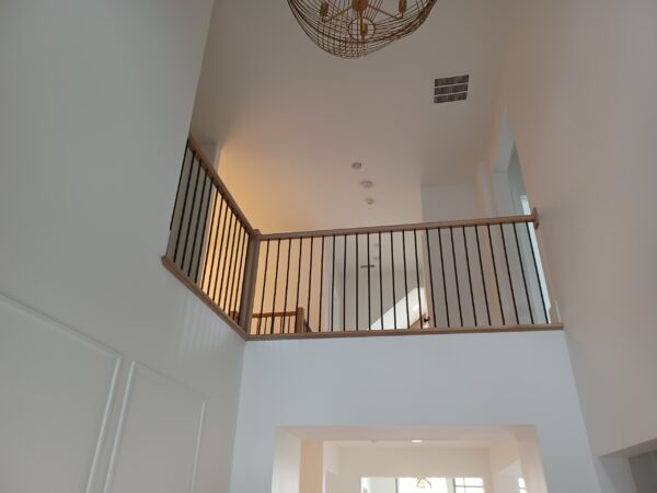
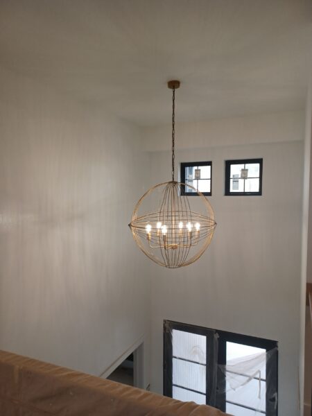
How Pittsburgh's Light Affects White Paint
Pittsburgh's unique lighting conditions significantly impact how white paint appears throughout the year.
Gray Sky Effects
Our frequently overcast skies create consistent, diffuse light:
- Cool whites may appear cold or drab
- Warm whites maintain their inviting quality
- Stark whites can feel harsh
- Greige tones tend to perform consistently
Seasonal Considerations
Pittsburgh's dramatic seasonal changes affect white paint differently:
- Winter: Cool, low-angle light emphasizes blue undertones
- Summer: Warm, bright light brings out yellow undertones
- Fall/Spring: Variable light creates shifting appearances
Room Orientation
Which direction your windows face matters:
- North-facing: Receives cool, bluish light—warm whites compensate
- South-facing: Receives warm, yellow light—cool whites balance
- East-facing: Morning light is warm; cool whites work well
- West-facing: Afternoon light is warm; cool whites balance
Testing White Paint Properly
The stakes of choosing white are high—it's the dominant color in your room. Proper testing prevents costly mistakes.
Large-Scale Samples
Small paint chips don't reveal true color:
- Paint samples at least 12 inches square, ideally larger
- Apply two coats for accurate representation
- Place samples on multiple walls to test different light angles
- Paint directly on walls rather than movable boards for most accurate results
Observation Period
Give yourself time to evaluate:
- View samples at different times throughout the day
- Check samples on both sunny and overcast days
- Observe under both natural and artificial lighting
- Live with samples for at least 3-5 days before deciding
Comparison Testing
Always test multiple options together:
- Compare 3-5 white options simultaneously
- Place samples adjacent to see subtle differences
- Note which samples feel right versus which feel off
- Consider family member reactions as well
Popular White Paint Shades Explained
Designer Favorites
Some white shades have earned reputations for reliable performance:
- Benjamin Moore White Dove: Warm, creamy, incredibly versatile
- Sherwin-Williams Alabaster: Soft white with subtle warmth
- Benjamin Moore Chantilly Lace: Clean white with minimal undertones
- Sherwin-Williams Pure White: Crisp without feeling cold
- Benjamin Moore Simply White: Fresh, versatile warm white
When to Choose Each Type
- True whites: Modern spaces, abundant light, high contrast desired
- Warm whites: Traditional homes, north-facing rooms, cozy atmospheres
- Cool whites: Contemporary spaces, south/west exposure, modern furniture
- Greige whites: Whole-house consistency, variable lighting, broad appeal
Coordinating White with Other Elements
Trim and Wall Relationships
When walls are white, trim considerations include:
- Same white: Creates seamless, modern look
- Slightly brighter white: Subtle trim definition
- Contrasting tone: Warmer walls with cooler trim or vice versa
Fixed Element Coordination
White must work with unchangeable elements:
- Wood floors typically have warm, orange, or cool gray undertones
- Countertops and tiles contain specific color casts
- Fireplace materials (brick, stone, tile) affect perception
Frequently Asked Questions About White Paint
Why does my white paint look yellow?
Several factors can cause yellowing: warm artificial lighting, interaction with warm elements in the room, or actual yellow undertones in the paint. Cool whites with blue-gray undertones resist appearing yellow.
Which white is best for low-light rooms?
Warm whites with subtle yellow undertones brighten dark spaces without feeling cold. Avoid stark whites that can appear gray in low light. Greige tones also work well.
Can I use the same white throughout my house?
One white throughout can work, but different lighting in each room means the same white may appear different. Some homeowners adjust shades slightly room by room for consistent appearance.
Should ceilings be the same white as walls?
Ceilings can be the same white for seamless flow, or a flat bright white for height perception. The traditional approach uses ceiling white that's slightly brighter to draw the eye upward.
How do I choose between similar whites?
Test them side by side on your actual walls. Differences that seem imperceptible on chips become obvious when painted large. Trust your gut response—one will feel right.
Does the finish affect how white looks?
Absolutely. Flat finishes absorb light and appear more muted. Satin and semi-gloss reflect light and can appear brighter. The same white in different sheens can look surprisingly different.
Professional White Paint Application in Pittsburgh
At Fagan Painting LLC, we help Pittsburgh homeowners navigate the complex world of white paint selection. Our experienced team understands how Pittsburgh's lighting affects color perception and can guide you to white shades that will look beautiful in your specific spaces.
We provide color consultation, large-scale sample testing, and flawless application that ensures your white paint looks exactly as intended.
Contact us for a free estimate on your interior painting project. We serve Pittsburgh and surrounding communities including Squirrel Hill, Shadyside, Fox Chapel, and throughout the region.