Choosing Paint Colors That Brighten Pittsburgh Homes in Winter
Choosing Paint Colors That Brighten Pittsburgh Homes in Winter
Choosing Paint Colors That Brighten Pittsburgh Homes in Winter
If you have lived in Pittsburgh through a single winter, you know the color of the sky. It isn't quite white, and it certainly isn't blue. It is a persistent, flat sheet of slate gray that settles over the three rivers sometime in November and often refuses to leave until April.
This meteorological phenomenon, while part of our city's charm, presents a unique challenge for homeowners. The lack of natural sunlight can make interiors feel cave-like, dreary, and smaller than they actually are. We spend months huddled indoors, relying on lamps and overhead fixtures, often feeling a vague sense of seasonal gloom.
However, there is a powerful antidote to the Pittsburgh gray: paint.
The right paint color has the ability to manipulate light, trick the eye, and simulate the warmth of the sun even when the forecast calls for another week of cloud cover. Choosing these colors, however, requires more strategy than simply picking a swatch that looks pretty in the hardware store. You have to understand how Pittsburgh's specific winter light interacts with pigment.
This guide is designed to help you navigate the color spectrum with a specific goal in mind: brightening your home. We will explore the science of light reflectance, the psychology of warm versus cool tones, and the specific hues that act as liquid sunshine for your walls.
The Pittsburgh Light Factor: Why Your Walls Look Different in January
To choose the right color, you first have to understand the environment it lives in. Light is the engine that drives color perception. Without light, there is no color.
Low-Angle, Cool Light
In the summer, the sun is high directly overhead, providing a strong, warm, and relatively neutral light. In a Pittsburgh winter, the sun sits much lower on the horizon, even at noon. The light that does filter through the heavy cloud cover is "cool"—meaning it has a blue or gray cast to it.
This cool natural light acts as a filter.
It dulls warm colors: A vibrant orange might look muddy or brown.
It intensifies cool colors: A light gray might look icy blue or depressing.
The Artificial Light Reliance
Because our days are short, Pittsburgh homes rely heavily on artificial lighting. The color temperature of your light bulbs (measured in Kelvins) becomes a major player in how your paint looks.
Soft White (2700K): Adds a yellow warmth, which can make white walls look creamy but can turn blues into greens.
Daylight (5000K): Mimics the blue-white of noon sun. This can make interiors feel stark and clinical if the wall color isn't chosen carefully to soften it.
The goal of brightening a Pittsburgh home isn't just to make it "whiter." It's to counteract the blue-gray natural light and work harmoniously with your artificial lighting to create a space that feels energetic and open.
The Science of LRV: Your Secret Weapon
When professionals choose colors to brighten a room, they don't just look at the hue; they look at the LRV, or Light Reflectance Value.
Every paint color has an LRV number on the back of the swatch, ranging from 0 (absolute black, absorbing all light) to 100 (pure white, reflecting all light).
Black: Absorbs light.
White: Bounces light back into the room.
For a Pittsburgh home struggling with low light, you generally want to target colors with an LRV of 60 or higher. These colors act as reflectors. When the meager winter light hits your walls, a high-LRV paint will bounce that light around the room, amplifying it rather than absorbing it.
However, don't just default to the highest number (bright white). In a room with zero direct sunlight, a stark white (LRV 90+) can actually look gray and shadowy because it has no warm light to reflect. It becomes a mirror for the gray sky outside. This is why "off-whites" and creams are often better choices than pure white for our region.
The Best Colors to Counteract the Gray
So, which colors actually work? We need hues that bring their own energy to the party. We are looking for colors that have warm undertones—yellow, red, or orange—even if the color itself isn't "yellow" or "red."
1. Warm Whites and Creams
If you love the clean, minimalist look, stay away from "cool whites" that have blue undertones. They will look frozen in January. Instead, opt for whites with a creamy, yellow, or slightly peach base.
Why they work: They mimic the glow of candlelight or sunlight. Even when the light hitting them is gray, the yellow pigment in the paint warms it up before reflecting it back to your eye.
Where to use them: Living rooms, kitchens, and large open-plan spaces where you want maximum light bounce.
Pro Pick: Look for colors like Benjamin Moore's Swiss Coffee or Sherwin-Williams Alabaster. These are soft enough to be cozy but bright enough to open up the room.
2. Sunny Yellows (But Be Careful)
Yellow is the most obvious choice for "instant sunshine," but it is also the hardest color to get right. A yellow that looks cheerful on a chip can look like a school bus once it's on four walls.
Why they work: Yellow is the color of optimism. It literally stimulates the brain.
The Strategy: Go softer and more "buttery" than you think you need to. Avoid lemon or neon yellows. Look for yellows that have a bit of brown or ochre in them to ground the color.
Where to use them: Breakfast nooks, kitchens, or laundry rooms—spaces where you want high energy in the morning.
3. Pale Pinks and Blush
Blush pink is having a major design moment, and for good reason. It is essentially a neutral that acts like a warm hug.
Why they work: Pink is derived from red, the warmest color on the spectrum. A very pale, dusty pink acts like a warm white but adds a rosy glow to the room that flatters skin tones and makes the space feel physically warmer.
Where to use them: Bedrooms, bathrooms, and dining rooms.
Pro Pick: Farrow & Ball's Setting Plaster or Sherwin-Williams Intimate White (which is barely pink).
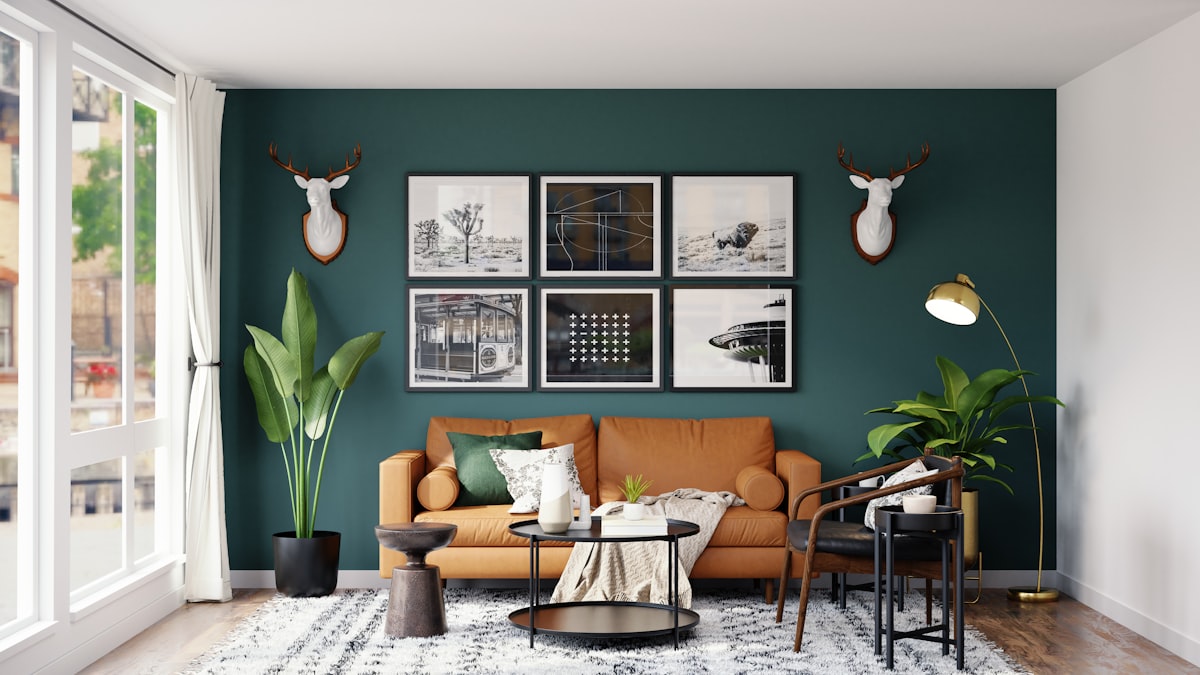
4. Warm Greiges (Gray + Beige)
If you can't quit neutrals, swap your cool grays for "greige." This hybrid color bridges the gap between modern gray and traditional beige.
Why they work: They offer the sophistication of gray but with a tan/brown undertone that prevents the room from feeling chilly. They are incredibly versatile and work with almost any furniture.
Where to use them: Hallways, living rooms, and master suites.
Pro Pick: Sherwin-Williams Agreeable Gray or Benjamin Moore Revere Pewter.
5. Biophilic Greens
While green is technically a cool color, certain shades of yellow-green (think spring leaves or moss) can breathe life into a winter room.
Why they work: They remind us of nature. In the dead of winter when the trees outside are bare skeletons, a soft, organic green wall connects us to the memory of spring. It feels fresh and oxygenating.
Where to use them: Home offices or reading nooks.
Colors to Avoid in Low-Light Rooms
Just as some colors are heroes, others are villains in a Pittsburgh winter.
1. Cool Grays and icy Blues
Unless you have south-facing windows that get blasted with rare sunlight, avoid grays with heavy blue or violet undertones. In the low light of January, these walls can look like concrete. They suck the energy out of a room and make it feel physically colder.
2. Muddy Browns
While warm, dark browns can absorb too much light. If a room is already small and dim, a heavy brown will make it feel claustrophobic.
3. Stark, Hospital White
As mentioned earlier, pure white needs natural light to bounce. Without it, it looks flat and shadowy. If you paint a north-facing Pittsburgh living room pure white, the corners will look dingy and gray, not crisp and clean.
Strategic Use of Sheen to Amplify Light
Color is only half the battle. The finish (sheen) of the paint plays a massive role in how bright a color appears.
Matte/Flat: Absorbs light. Great for hiding wall imperfections, but does nothing to brighten a room.
Eggshell/Satin: Reflects light.
Semi-Gloss/Gloss: Highly reflective.
The Strategy
To brighten a dark room, bump up the sheen one level higher than you normally would.
Walls: Instead of matte, choose a high-quality Eggshell. The slight luster will bounce light from your lamps around the room, making the color feel more alive.
Ceilings: Most people paint ceilings flat white. Try using a Satin white on the ceiling. It will reflect the light from your floor lamps back down into the room, effectively increasing the ambient brightness.
Trim: Use Semi-Gloss on baseboards and window casings to create crisp, bright borders that define the space.
Testing Your Colors: The Winter Rules
You cannot trust the lighting in the paint store. Those fluorescent industrial bulbs have nothing in common with your living room lamps or the Pittsburgh sky. You must test in situ.
1. The Large Swatch Rule
Do not paint a tiny 2-inch square. Buy a sample pot and paint a poster board (at least 2 feet by 2 feet). Or, paint a large section of the wall directly. You need to see enough of the color to understand how it affects the space.
2. The 24-Hour Test
Leave the swatch up for at least 24 hours. You need to see it in three specific conditions:
Morning Gray: How does it look at 9:00 AM with the winter sun trying to break through?
Afternoon Gloom: How does it look at 3:00 PM when the light starts fading?
Evening Artificial: How does it look at 7:00 PM under your lamps?
3. The "Lights Off" Test
Stand in the room during the day with all the lights off. Does the color die? Does it turn muddy? If the color only looks good with a 100-watt bulb blasting it, it might not be the right choice for a relaxing atmosphere.
Beyond the Walls: Accent Strategies
Sometimes, painting the whole room isn't the answer. You can use color strategically to trick the eye.
The "Glowing" Accent Wall
If you are afraid of painting an entire room yellow or coral, use it on one wall.
Which Wall? Choose the wall opposite a window. Even if the window only lets in weak light, that wall will catch whatever enters. Painting it a warm, reflective color turns it into a giant reflector for the rest of the room.
Painted Furniture
If you want to keep your walls neutral, introduce brightness through painted furniture. A bright turquoise bookshelf or a cherry-red side table can act as a visual anchor, drawing the eye and breaking up the monotony of the gray winter light.
Don't Forget the Trim
Who says trim has to be white? In a small, dark room, painting the trim the same color as the walls (monochromatic) can actually make the room feel bigger and airier because your eye doesn't stop at the borders. Alternatively, painting trim a soft cream instead of stark white softens the transition and adds warmth.
Conclusion: Painting Your Way to Spring
We cannot change the Pittsburgh weather. The gray skies of January, February, and March are part of the deal we make for living in this beautiful region. But we don't have to let the weather dictate the mood of our homes.
By understanding the physics of light and choosing colors that fight back against the gloom—creamy whites, warm greiges, and soft blushes—we can create interiors that feel like a sanctuary. A fresh coat of the right paint doesn't just cover scuff marks; it changes the emotional temperature of the house.
So, this January, don't just endure the dark days. Grab a roller, pick a color with some soul, and bring your own sunshine indoors. Your home will feel happier, warmer, and brighter—long before the first crocuses poke through the snow in Phipps Conservatory.